Good heavens, no! I develop training programmes for clients.
Don't get me wrong - I don't have any pretensions about being a serious graphics artist: I just enjoy doing this stuff. Nevertheless, I read quite a few graphics blogs online, including But Does It Float, Infosthetics, The Ministry of Type, The Art of the Title Sequence, and I used to be a big fan of the now defunct Waxin' and Milkin', Drawn! and Ffffound! websites.
Because when I look at a graphic work, I don't want to feel that I could have done better. I want to see something I know that I couldn't possibly have done myself. I want to be able to recognise the skill involved in creating it. At the bottom of the page there are links to sites featuring artists who regularly make me feel that way.
At home, when I was a small child. I've loved drawing for as long as I can remember and I would draw on any available piece of paper that my parents left lying around, including (to their dismay) their books. I started reading early. The initial attraction was the visual representation of information in books like How and Why it Works, a 1948 book published by Odhams full of cutaway illustrations of machines, or The Wonder Book of Do You Know? and the Junior Pictorial Encyclopedia, both published by Ward Lock, which were written for children and are full of photographs, paintings and drawings. I still have all three of those books here at home, and leafing through their pages (as I have just done) took me right back to my early years.
Thinking about what I was like back then, I realise that I could remember pictures vividly, even before I learnt to read. I still can. I was a weird kid. The whole drawing thing is probably another aspect of some strange neural wiring for my visual system.
By the time I was 6 or 7 years old, I was creating representational art rather than random squiggles or naive pictures. I used to draw a lot of characters from comics such as Hergé's Tintin. The clean, technical approach that Hergé used reminded me of those diagrams in my favourite childhood books. Later on, I started to copy other pictures that I liked. That turned out to be a very good way of learning technique, and of understanding what made a drawing work. It helped me to understand composition and perspective, too. And all the while, I was creating pictures of my own.
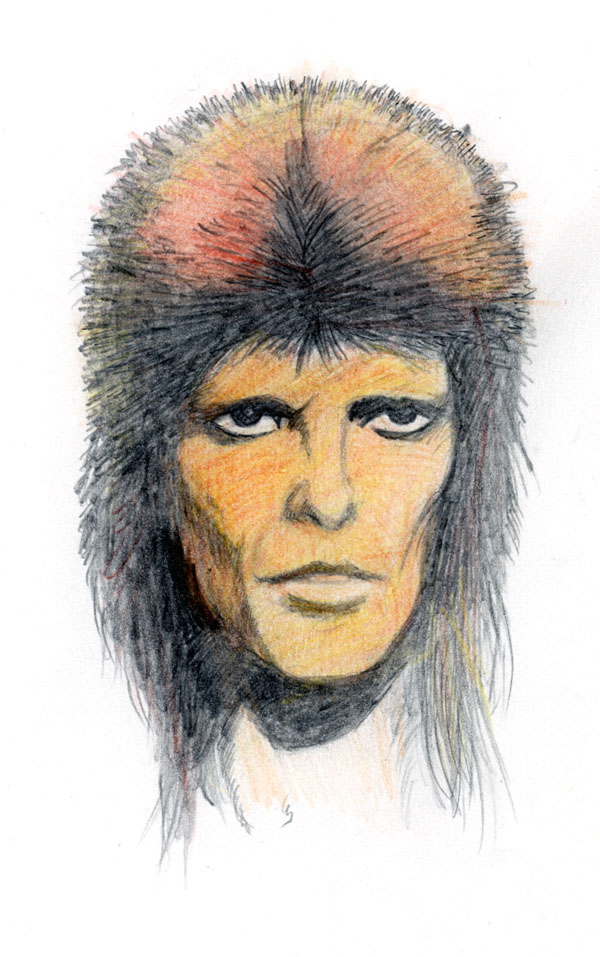
When I started drawing my own pictures, they were usually landscapes populated with fantastic machines. I had discovered the work of William Heath Robinson when a relative bought me Norman Hunter's Professor Branestawm books and I instantly became obsessed with his technique and the fantastical creations that he came up with. Under the encouragement of my mother I also made attempts at still life, but as my technique improved I started to work on portraits of people. By the time I hit my teens, I think I'd got pretty good. I usually worked from photos cut from the Radio Times or the Sunday supplements; here's one that turned out quite well, I think: David Bowie in his Ziggy Stardust phase. A bigger version's available if you click on the image.
In my teens I started reading the UK music papers, and discovered the work of Edwin Pouncey, a.k.a Savage Pencil. His fluid style started me thinking about different ways of representing the things I liked to draw. For me, he had about the same impact that Picasso's cubism had on the art world. "You can do that?"
In the late 70s, the family moved to London and I started hanging around Dark They Were and Golden-Eyed and Forbidden Planet at weekends and buying comics and science fiction novels. In 1978 or so, I first encountered Curt Vile's work in Sounds, as I described earlier. Wanting to read more of that sort of thing led me to discover the work of first Gilbert Shelton and then Robert Crumb. I wanted to join in the fun they were obviously having, so I bought a Rotring pen. Seeing how much better my sketches looked when drawn with jet-black indian ink was the tipping point. Suddenly, drawing as a harmless pastime began to turn into something deeper and way, way more obsessive than was good for me.
By 1979 I was spending most of my spare time drawing. Quite frankly, it became a lot more fun than the academic work I should have been doing at the time. I very quickly passed the ten thousand hours mark that Malcolm Gladwell suggests (rightly or wrongly) you should spend if you want to become an expert at something. The challenge of making a picture that looked like someone was no longer enough; I wanted my drawings to look more like photographs. I forgot Savage Pencil's abstract style and became obsessed with photorealism. Pointillism became my favourite technique once I realised that I could take the dots of Alan Moore's approach and use them to represent grains of film from contrasty black and white photographs. I went back to the music papers, which were full of photographs like that, and started copying them. It took a lot of practice to learn how to look at someone with an artist's eye and then create something on paper that other people will recognise as being that person. Each person has something about them that makes them who they are. It's easier to spot this in some people than it is in others; I once spent almost a week making preliminary sketches of David Byrne before finally realising that he was squinting at the camera in the picture I was using as a source. Getting the focus of his gaze right was what made the portrait work.
Then I discovered bandes dessinées and the French publishers Metal Hurlant and Les Humanoïdes Associés and pretty much lost my mind. I still haven't found anyone with a better graphical technique or greater creative drive than Jean "Moebius" Giraud, and he became my hero and my spirit animal. He still is. This is the guy who designed the spacesuits in Alien and the costumes in Tron; he was responsible for all the cool bits in the Heavy Metal movie, and he appeared to have an imagination that was far, far weirder than any other comics artist I'd ever encountered. He had - and still has - a huge influence on my graphical style, and it's thanks to him that I'm obsessed with cross-hatching.
Back in the 1980s, you couldn't really buy posters of artwork of his, so I had to make my own. This is my version of a classic Moebius painting of his character Arzach. Mine was done with Rotring pen and watercolours.
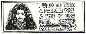
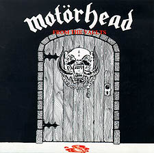
I would probably have grown out of all of this by the early 1980s, were it not for the fact that I went to see Motörhead at the Hammersmith Odeon, where I met Philthy's sister Helen Taylor, who was setting up a fan club for the band called the Motörheadbangers. I took one of her flyers, and when I sent it off the next week with my membership application, I drew the Motörhead logo on the back of the envelope.
Little did I know what that spur-of-the-moment act would lead to.
I got a letter back from Helen's boyfriend Paul. "Got any more?" he asked.
Of course I had, so I sent some in.
They liked them.
And in passing I'd just like to point out that the drawing above mine was produced by a young chap by the name of Simon Bisley. Yes, that Simon Bisley.
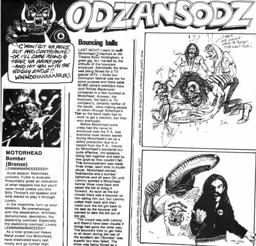
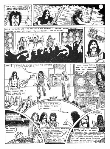
I sent in some more drawings. By now I'd been reading the British comic 2000AD for many years, so I had the idea of drawing the band as Judges in Mega-City One. When Lemmy visited the fan club office in Leeds, he saw the drawing and Helen later told me that he immediately said "I want that on a t-shirt!" The fan club duly had some made, and when I saw a photo of Motörhead and Girlschool in Sounds a few weeks later where Lemmy was wearing one, I was so hyped I don't think my feet touched the floor for a week. So I drew a few other designs for shirts. Some time later I was at a friend's house one Saturday after a night out, and when we turned on the TV to watch OTT, there was Chris Tarrant, wearing one of my new designs. I have seldom been so excited.
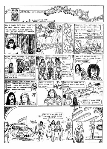
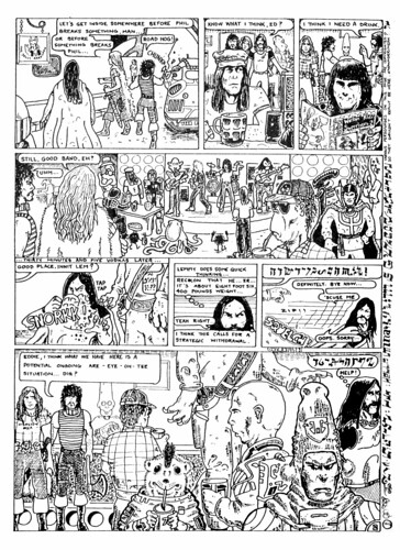
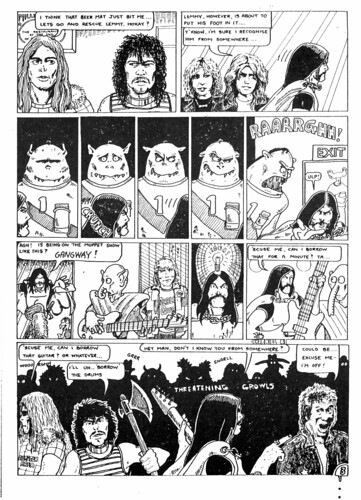
The fan club started passing on art direction from Lemmy. "Do a Conan story," I was told. So I did...
I got a phone call one weekend from Paul. "Don't bother buying tickets for the next tour. You're on the guest list." The next thing I knew, I was hanging out backstage with the likes of Girlschool, Frank Marino, Ozzy Osbourne, Canadian prog rockers Triumph, Twisted Sister, and of course Motörhead themselves. I made a number of great friends in those days and nearly forty years later, I'm still in contact with them.
Over the next decade I continued to do artwork for the Motörheadbangers magazine, which was pretty heady stuff considering one of the other contributors at the time was Joe Petagno, the creative genius who came up with the Motörhead logo.
Here's a picture of another famous person with a Motörhead connection. Michael Palin was a hero of the band's and he was the co-owner of Redwood Studios, where the band recorded tracks for their album Rock and Roll—when the band found this out, they somehow talked him into appearing on the album. Of course, his picture then had to appear in the fan club magazine.
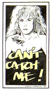
Lemmy wrote songs with a surprisingly large number of other artists including Ozzy Osbourne, but I think my all-time favourite collaboration was a song Lemmy wrote with Lita Ford, who is shown here. Lita used to be in The Runaways with Joan Jett, and went on to have a successful solo career; she's a very talented musician and a killer guitarist. I saw her supporting Ritchie Blackmore's Rainbow at the Michael Sobell Sports Centre in London, back in the days when Joe Lynn Turner was the singer, and well before Ritchie went all medieval on us. Incidentally, did you know that Lita Ford was born in England?
I wrote the song title with a yellow marker pen, drew around it with one of my Rotring pens, pencilled in the portrait, and then inked it in with a Rotring pen before using an eraser to get rid of the pencil marks. I went through a phase of labelling everything with that style of writing; I've always been fascinated with the art of calligraphy, but that is a whole other story.
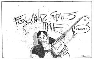
I continued to collect books of graphics, and when, early on, I discovered a copy of Hunter S. Thompson's Fear and Loathing in Las Vegas I became a huge fan of the inspired mayhem of the one and only Ralph Steadman.
Of course, I had to have a go at that sort of style and the natural place to try it out was in an illustration for the Motörheadbangers magazine, but I'll freely admit that I can't carry it off like the master can.
One of the proudest moments of my graphical career was when I got a call from Alan Burridge, who had taken over running the Motörheadbangers after Philthy left the band and Helen and Paul moved on to other things. He'd been asked to write the sleeve notes for a compilation album of the band's music that was being put together by Sequel Records. Did I fancy having a go at designing the sleeve? He didn't have to ask me twice, although I really didn't know what was involved in putting something like this together. I had to prep camera-ready artwork for the sleeve notes and the back cover, formatted for both CD and cassette. I had to do the label design. And I had to do the whole thing on a borrowed Apple Macintosh in two weeks, and I'd never used a Mac before. How on Earth I managed it, I will never know. It was quite an experience - luckily, it was a successful one.
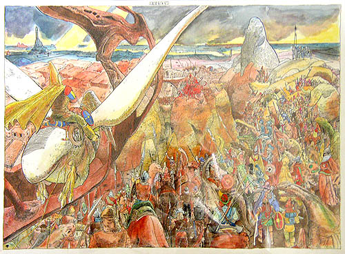
As the 80s rolled on I was still reading comics and for some reason I got it into my head that I should try and combine all my different interests - rock music, film, science fiction and comics - on a single sheet of paper. The picture below was the result. Again, you can click on the image for a larger version; you'll probably need to see it in close-up to make out most of the characters in the background.
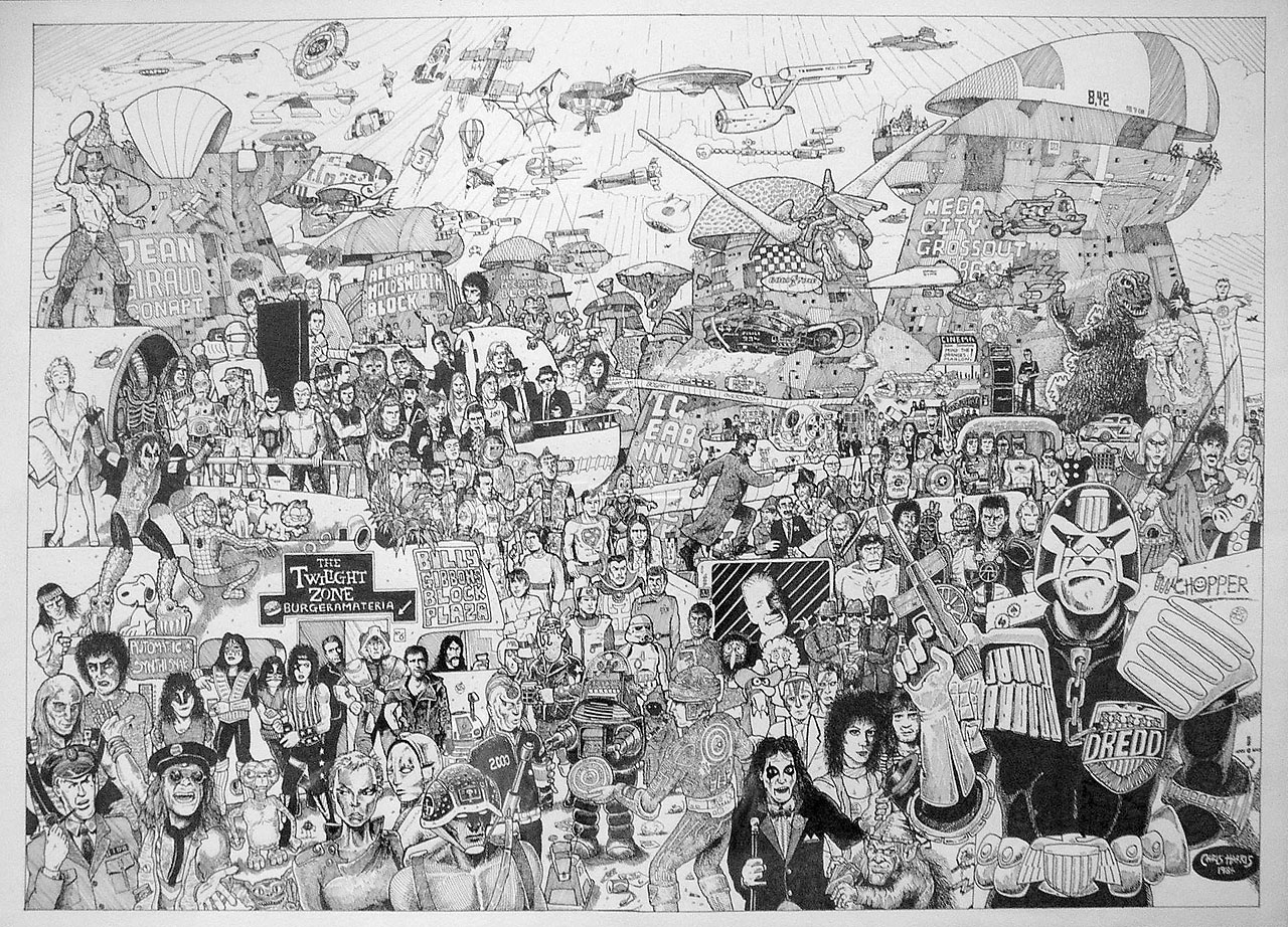
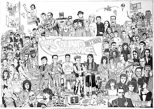
It was profoundly satisfying to create the ridiculously dense level of detail in the drawing and I was very pleased with the result at the time. When some friends saw it they asked me if I'd mind doing some stuff in the same style for the band they were in (which I occasionally played keyboards for). They gave me a list of people they wanted standing around them, rather like the Beatles' Sergeant Pepper album. My version was quite a lot weirder; I don't think the Beatles would have featured Geoffrey, Zippy and Bungle from Rainbow alongside George Orwell, Alf Garnett, or Dave Lee Roth. The band never did hit the big time, but the last time I checked, their singer was director of programming at Capital Radio. It's strange how these things turn out.
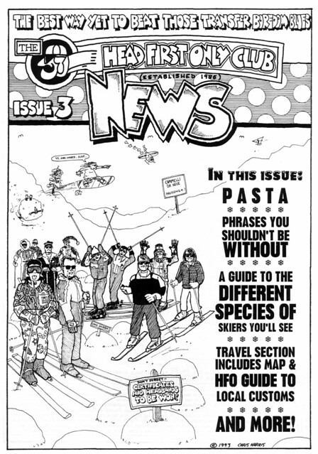
In the late 80s, some friends and I discovered the joys of skiing and set up the Head First Only Club, which was also the original reason why I set up this website. I ended up doing some of the writing and all of the illustration for the HFO's very occasional skiing newsletters. If you've still got a copy of one of the four issues that we ran to, you own a collector's item.
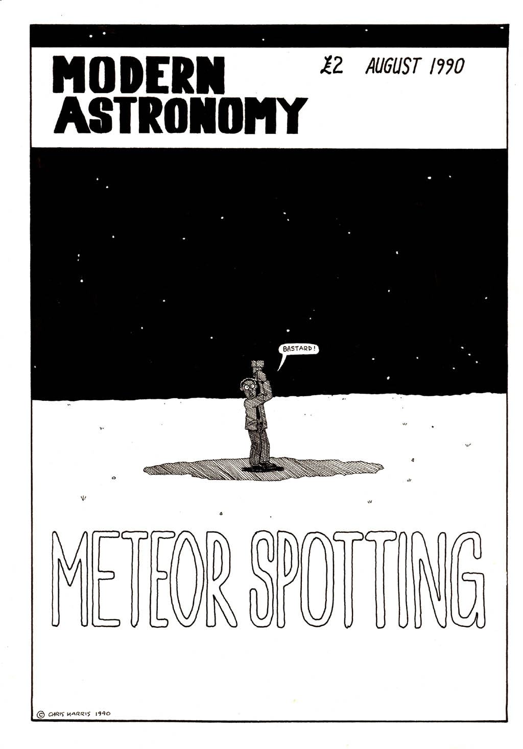
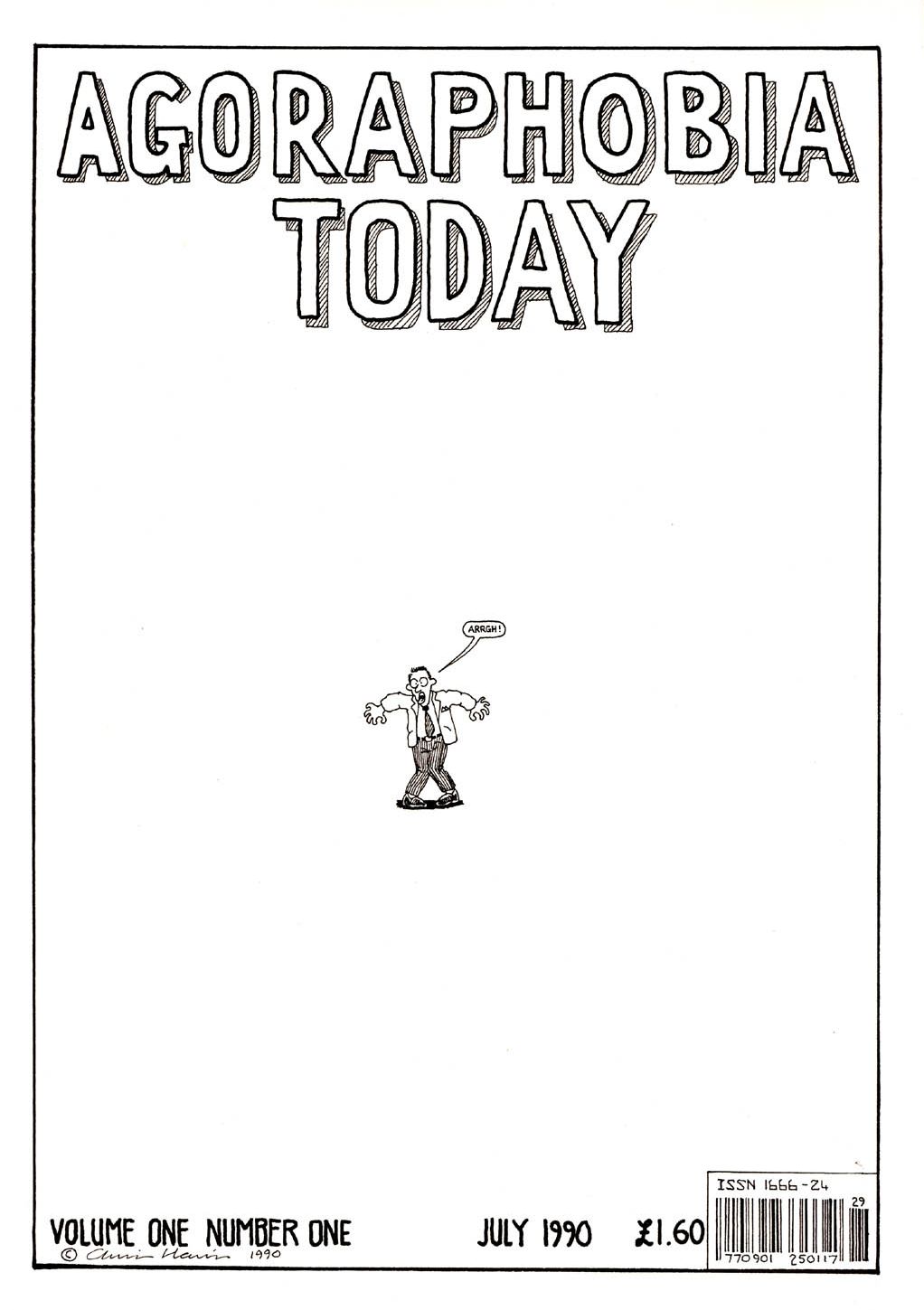
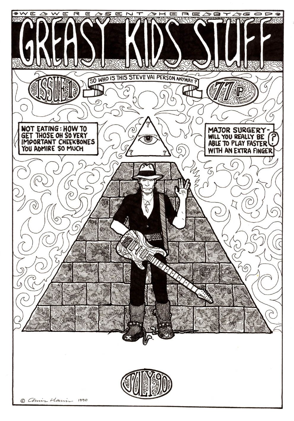
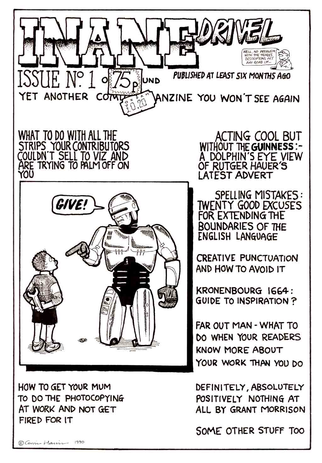
I moved to Milton Keynes in 1986 and by the early 90s I was married. I had other things to do besides drawing, and my creative activities tailed off. These covers for imaginary magazines were pretty much the last—and only—pieces of artwork that I created around that time.
In the mid 90s I went through several massive personal and professional changes, and drawing was pushed even further to the back of the queue. I had more pressing concerns. And, sadly, it's stayed there ever since, pretty much. There's more than a little bit of obsessiveness required to produce large-scale work like I used to do, and I don't know if I've got (or want) the capacity for it any more. Is that a good thing, or a bad one? I don't know. Perhaps it means I've become more normal. Perhaps not - you'll have to ask my friends about that one, because I'm not sufficiently removed from the situation to make a judgment.
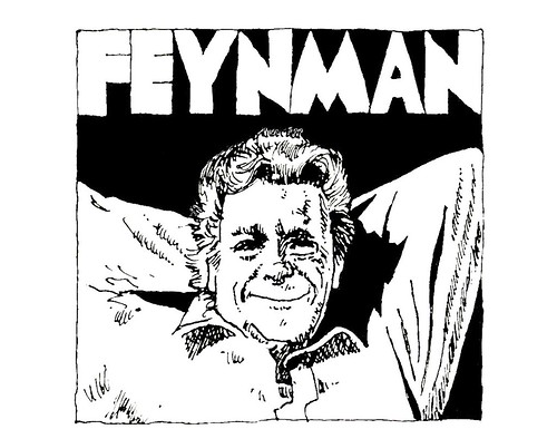
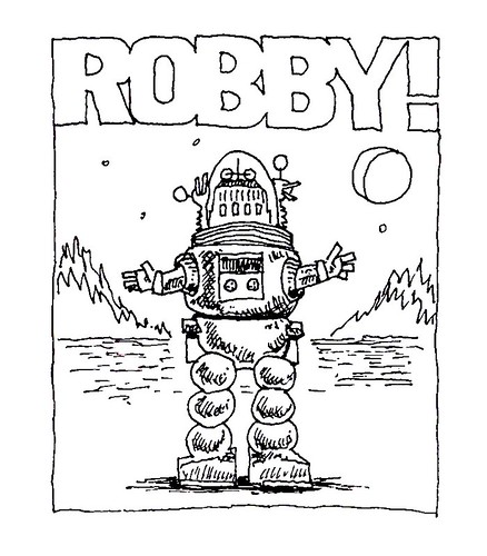
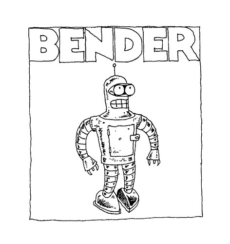
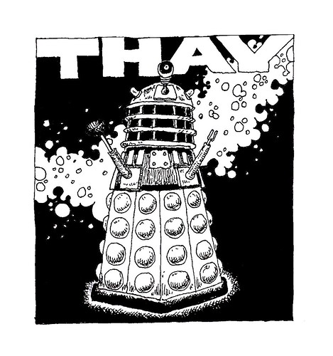
All the same, I still draw all the mastheads and banners for this site. Although I have a Wacom tablet to produce graphics directly on my PC these days, I still prefer working with ink on paper. I know that a tablet is faster, you don't get covered in ink, and you don't have to wash the pen out in the sink every couple of weeks; somehow, it's just not as much fun. So I still use my Rotring pens; when the ink's dried, I scan each drawing in to my computer, where I use the tablet for retouching, then I add colour and a drop shadow to create the results you'll be familiar with after a quick trip around the rest of the website. The blog has had a different banner graphic for pretty much every month since I started it, back in 2003. You'll find other illustrations scattered around this website, too.
The passage of time has definitely affected my drawing style. My hands aren't as steady as they used to be, although the "noise" that this introduces into a drawing has a rather appealing quality to it, I think. One thing I discovered in recent years is that if you don't give your bottles of indian ink a good shake every now and then, the carbon that gives it that rich blackness will eventually settle out. I wondered why my drawings were getting lighter and lighter until I took a close look at my ink bottle and discoved a layer of sludge at the bottom; it was thirty-five years old at that point, though. If there's anything that shows how long I've been doing this sort of thing more effectively, I don't know what it is.
My drawing board now takes pride of place in the conservatory I had built at the back of the house a few years ago. I've moved all of my graphics gear in there, which freed up a considerable amount of space in the house for my other creative pursuits. The conservatory is a nice bright room, with plenty of space to stretch out in. The drawing board is now also fitted with a Camera Lucida, which I've started to get to grips with. I've wanted one for years and when I saw the NeoLucida campaign on Kickstarter, I couldn't resist.
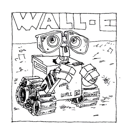
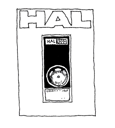
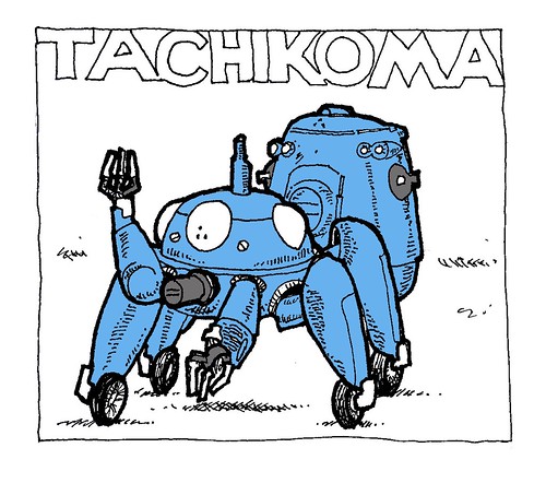
In October 2018, I decided to have a go at the #Inktober challenge for the first time. You have to create a drawing in ink every day for a month and post the results to social media. Although I was very rusty for the first couple of days, much to my surprise, I succeeded. And I had a great time taking part.
After taking part, I found myself thinking that I really ought to get back into drawing again. If I do, I'll share what I come up with here.
The artists listed here are my heroes. I can't begin to thank each and every one of them for the years of pleasure they have given me through their work. My life would be utterly different had I not been given the opportunity to savour their unique creativity and talent.
Note: I'm delighted that I can finally add a link to a site dedicated to the work of the great Ron Cobb...
Chris